

The old website functioned more like a directory than an experience. It lacked the city's energy, personality, and cultural richness. I set out to create something more human, emotionally resonant, and representative of Fort Worth today.
The site was designed to resonate with a younger audience and a wide range of visitors from local champions to out-of-state explorers. I prioritized flexible content and navigation that served:
I followed their five core principles: modernize the brand, improve usability, design mobile-first, guide engagement, and tell a broader Fort Worth story. Everything was built to scale, adapt, and inspire.
I introduced emotional visuals in the hero, added a robust events collection, created an interactive itinerary tabs, produced a stylized district map, included dynamic content modules, and incorporated a live social feed. Each decision was rooted in making the experience feel immersive and culturally relevant.
I built a flexible design system grounded in accessibility, local flair, and scalability. It included an Art Deco-inspired decorative elements, warm color palette, subtle paper textures, bespoke illustrated graphics, modern line work icons, and modular components for future marketing needs.
The homepage was designed to guide users through Fort Worth's story in a natural, emotionally engaging flow. I prioritized content based on user behavior data, stakeholder goals, and mobile usability:
Storytelling informed both layout and flow. I treated each section like a chapter, starting with Fort Worth’s shift in identity and ending with local insights and user-generated content. This helped users feel like they were discovering something personal and meaningful.
The new site repositions Fort Worth as an unexpected creative destination without losing touch with its roots. The experience is now accessible, scalable, and rich in personality—making it worthy of a Gold Marcom Award. The success of the redesign was perhaps best captured by the client's own feedback: 'If we had one word to describe this, it would be—DOPE.'
The client's reaction after the prototype presentation...

During our discovery session with Visit Fort Worth, several usability and engagement pain points emerged defining clear priorities for the redesign.
The redesigned site targeted regional travelers, out-of-state visitors, culturally engaged younger audiences, and locals alike. Fort Worth aimed to grow tourism by showcasing major events, sports, and its evolving identity as a creative, modern city grounded in Western roots.
“ We'd like to move away from the "dusty Western town" image and appeal to younger, culturally engaged audiences, foodies, art lovers, music fans. ”— Visit Fort Worth Team, Discovery Meeting


Partnering with Fort Worth’s creative team, we reimagined the site as a bold, user-focused platform for modern storytelling. Drawing inspiration from Hotel Drover and the city’s Art Deco style, the new design mixes muted colors, rich textures, and handcrafted details. Dynamic content modules, an interactive district map, scalable branding, and accessible UX bring Fort Worth’s evolving spirit to life for locals and visitors alike.


The Fort Worth website redesign successfully blends tradition with innovation, honoring the city's Western roots while embracing its evolving identity as a modern creative hub. Through thoughtful UX, dynamic storytelling, and a refined visual system, the new site invites visitors and locals alike to explore the Unexpected City. More than a redesign, it is a bold new platform for connection, discovery, and growth capturing Fort Worth’s spirit today and setting the stage for its future.
“ This is so great. Very, very cool. If we had one word to describe it, it would be—DOPE. ”— Tom Martens, Vice President of Creative, Visit Fort Worth
The City of Fort Worth needed its website refreshed to reflect its evolving brand, The Modern West. The old site was content-heavy, outdated, and difficult to navigate, especially for older audiences and first-time visitors. As Lead Visual Designer, I streamlined the user experience while capturing Fort Worth’s mix of western heritage, artistic flair, and modern energy.


Before the redesign, the Huntington Beach website faced several challenges that limited both user experience and brand impact. The site struggled with outdated visuals, scattered content, low engagement tracking, and accessibility gaps, all of which made it harder to reflect the vibrant, laid-back spirit of Surf City USA. These issues highlighted the need for a more modern, streamlined, and user-focused platform to better serve both visitors and locals.
During the prototype presentation, we unveiled a series of design updates crafted to reflect Huntington Beach’s vibrant identity. From a refreshed homepage and animated footer to dynamic social integration and an interactive regional map, every detail was designed to capture the spirit of Surf City USA. Our approach emphasized a cleaner, more intuitive user experience while honoring the laid-back coastal energy that defines Huntington Beach.
The listings, detail, content, and events pages were thoughtfully designed to ensure a consistent user experience, blending playful visuals with clear functionality to keep visitors engaged at every step of their journey.


Huntington Beach's team described the prototypes as "outstanding" and said simply, "We're all smiling — that should tell you everything." The excitement in the room confirmed that the design not only captured their vision but also set the stage for a bold new era of Surf City USA. With momentum, collaboration, and creativity leading the way, the project moved forward with a clear and confident path.
" This is like... this is outstanding. I don't know what else to say. This is definitely the direction we're going. This is exactly what we were looking for — from a technical and aesthetic perspective. We simply love it!"
— Omark A. Holmes, Chief Marketing Officer, Surf City USA
The City of Huntington Beach needed its website modernized to better reflect its polished, surf-forward brand. The previous site, while beloved, was underperforming and no longer aligned with the city’s signature vibe. As Lead Designer, I reimagined the digital experience to capture that modern coastal energy while elevating usability for visitors.


Before the redesign, LivCo’s site struggled to capture its evolving identity. It leaned heavily on outdated visuals, offered little storytelling, and lacked the energy needed to attract modern travelers.
The previous site was seen as “good enough” for too long. Our mission was to shift that mindset, creating a design that embraced outdoor recreation, food tourism, wellness, and rural lifestyle by transforming LivCo into a magnetic destination for weekenders, city escapees, and creative spirits alike.
Design-wise, we leaned into a playful “Low-Fi” grid style, quirky color combinations, and warm textures inspired by stickers, rustic signage, and a Wes Anderson-esque aesthetic that felt handcrafted and unexpected. The content strategy highlighted signature events like the NY State Festival of Balloons and the Hunt Race, while promoting hidden gems like local craft breweries, farm-to-table spots, and seasonal adventures. We prioritized flexible modules for storytelling (via the new “LivCo Stories” blog), an inclusive tone with LGBTQ+ business badges, and visual cues that emphasized sustainability and small-town authenticity.
A preview of the redesigned listing pages further showcased how each local experience was given a vibrant, editorial treatment. Every page reflected a deeper message: Come as you are, there is space for you here. The end result is a youthful, visually rich platform that makes rural feel relevant and sets the tone for LivCo’s next chapter as a destination on the rise.

The detail page design captures LivCo’s spirit with warm textures, playful layouts, and easy-to-digest storytelling. Every listing feels personal and inviting, encouraging exploration across categories like outdoor activities, dining, and hidden local gems. On mobile, the redesigned homepage ensures the same vibrant experience translates seamlessly, balancing bold visuals with quick access to itineraries, events, and local highlights. We also included micro-interactions within their footer creating lively hover animations for the call-to-action elements. Whether browsing at home or on the go, LivCo feels close, accessible, and ready to welcome all.


Through a bold redesign and a reimagined content strategy, LivCo’s website now invites visitors to discover the charm of rural New York with fresh eyes. Every element, from playful layouts to mobile-first storytelling, reinforces the message that adventure, authenticity, and community await just beyond the city limits. The new platform does not just promote tourism; it fosters a lasting emotional connection and helps LivCo grow into the welcoming, creative destination it was always meant to be.
Livingston County needed a website that balanced storytelling with structure, supporting their new bold visual identity. Partnering with their tourism and economic development team, I led the design of a digital experience that honored the county’s charm while appealing to younger, experience-seeking audiences.


Screenwriting Truth was created as a resource hub for aspiring and seasoned screenwriters, offering practical insights and industry guidance from Paul Guyot. As Creative Director, I built the platform’s brand identity and digital presence, including apparel graphics, book cover design, and a Webflow site with e-commerce integration. The result is a comprehensive platform that supports and inspires a community of storytellers.


Awesoos: The Photo Wranglers was an event photography venture that redefined the photo booth experience. Instead of stiff poses and camera intimidation, I created a patented hidden-camera platform that encouraged spontaneous, candid moments. From festivals and comicons to weddings and charity events, Awesoos delivered vibrant, engaging visuals and an unforgettable, interactive experience.
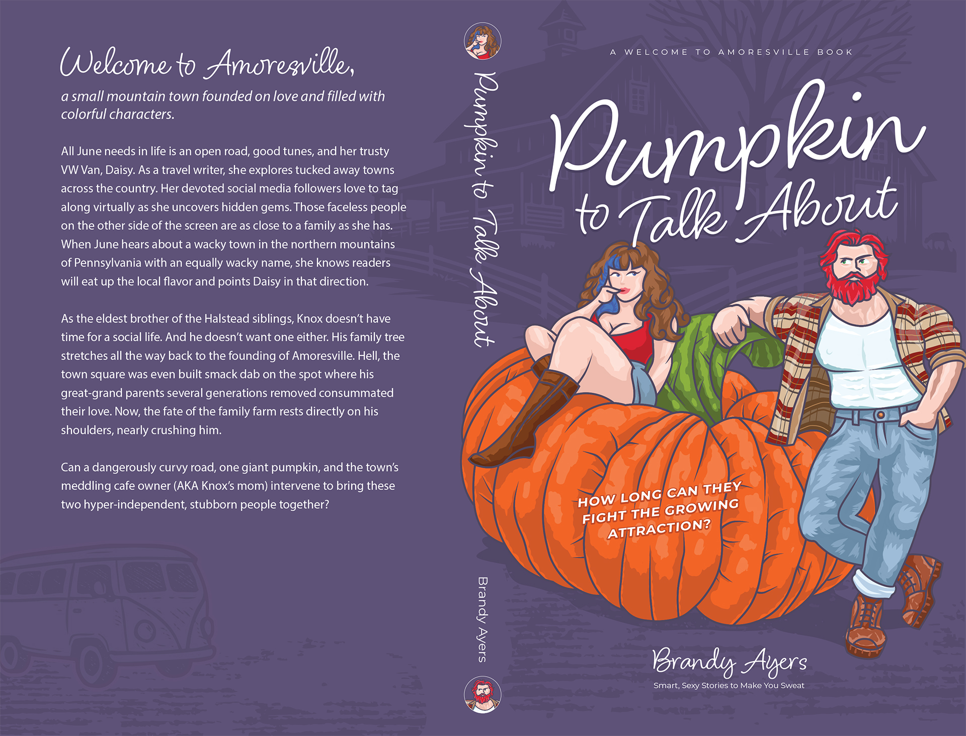

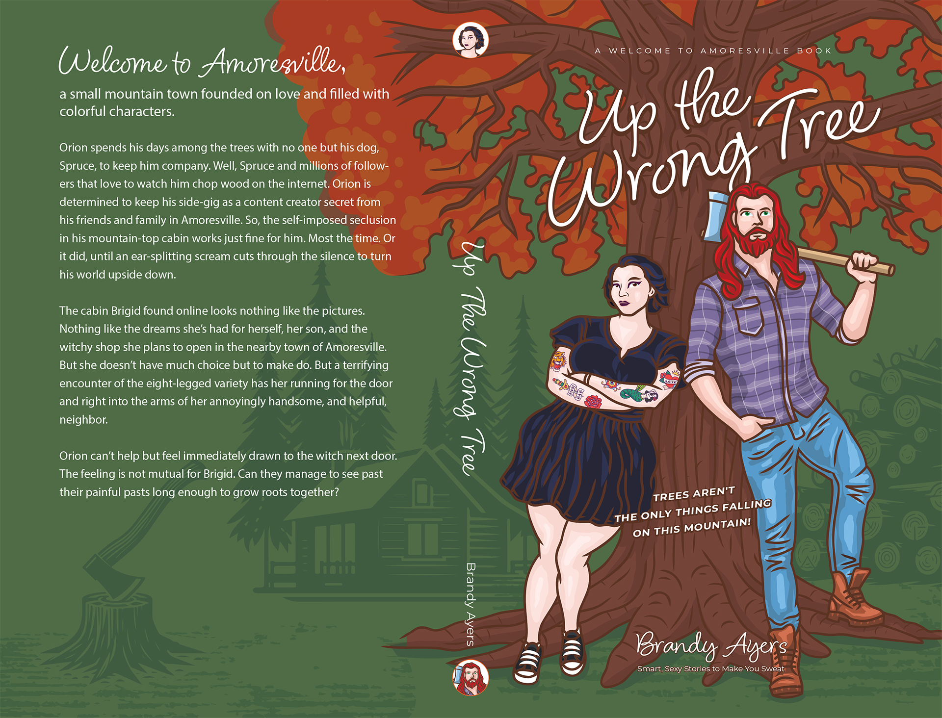

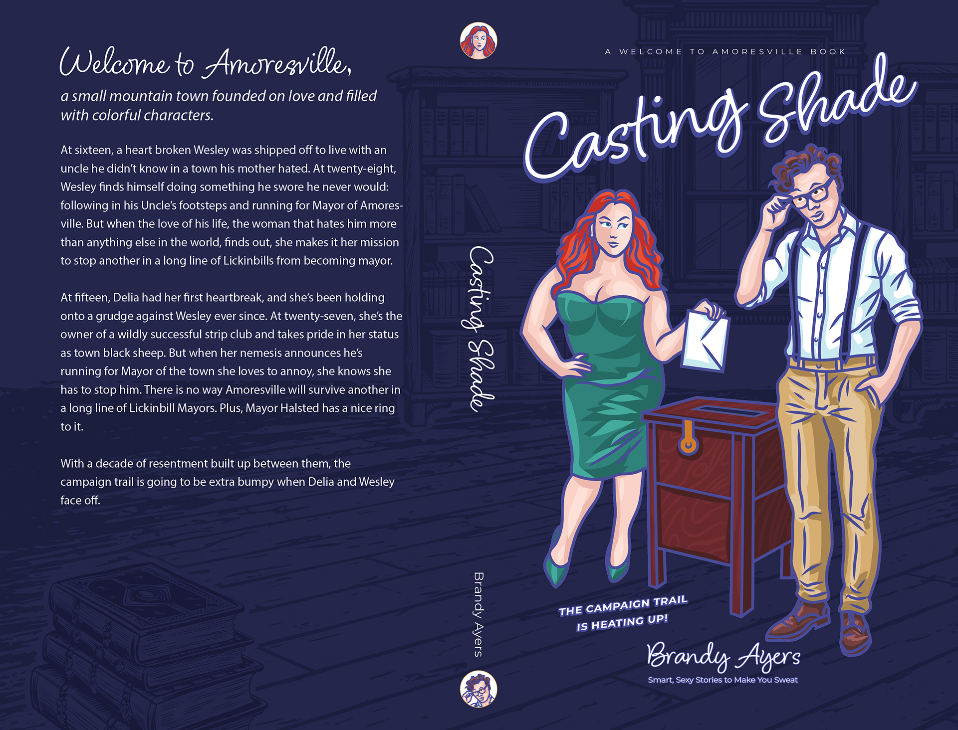
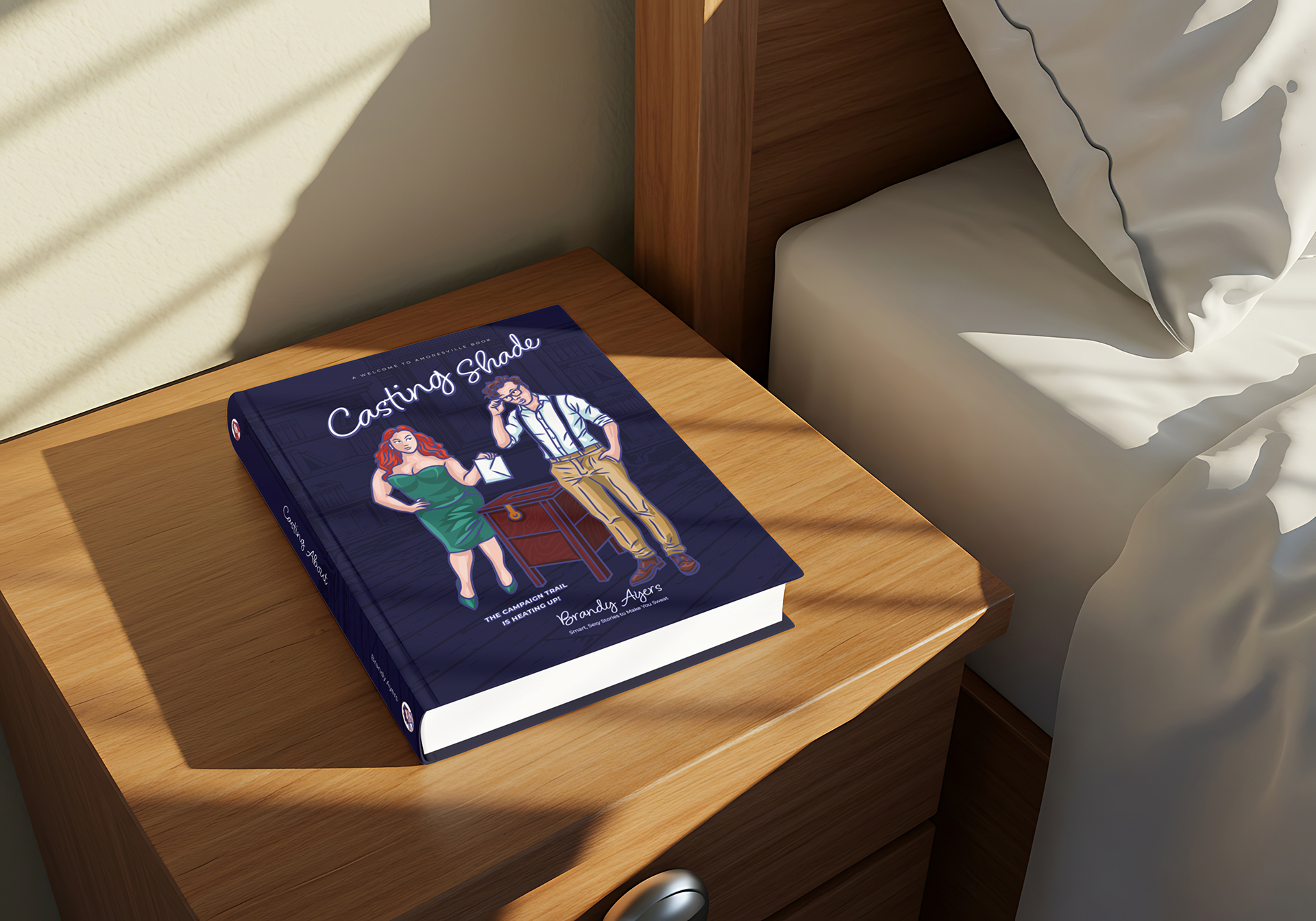
Contemporary romance author Brandy Ayers needed book covers that aligned with the illustrated trend in her genre. After discovering my illustration skills during our time at Simpleview, she invited me to create covers for her upcoming series. I provided both illustration and design, bringing her bold, ‘very spicy’ stories to life through vibrant, market-ready visuals.


My illustration work has always leaned toward bold, impactful graphics inspired by artists like Douglas Fraser, Mark Frederickson, and Shepard Fairey. Starting with traditional airbrush and Prismacolor techniques, I later transitioned into digital tools to expand my style. Today, I continue exploring illustration as both a creative outlet and a way to experiment with new possibilities, including AI as a tool for ideation.


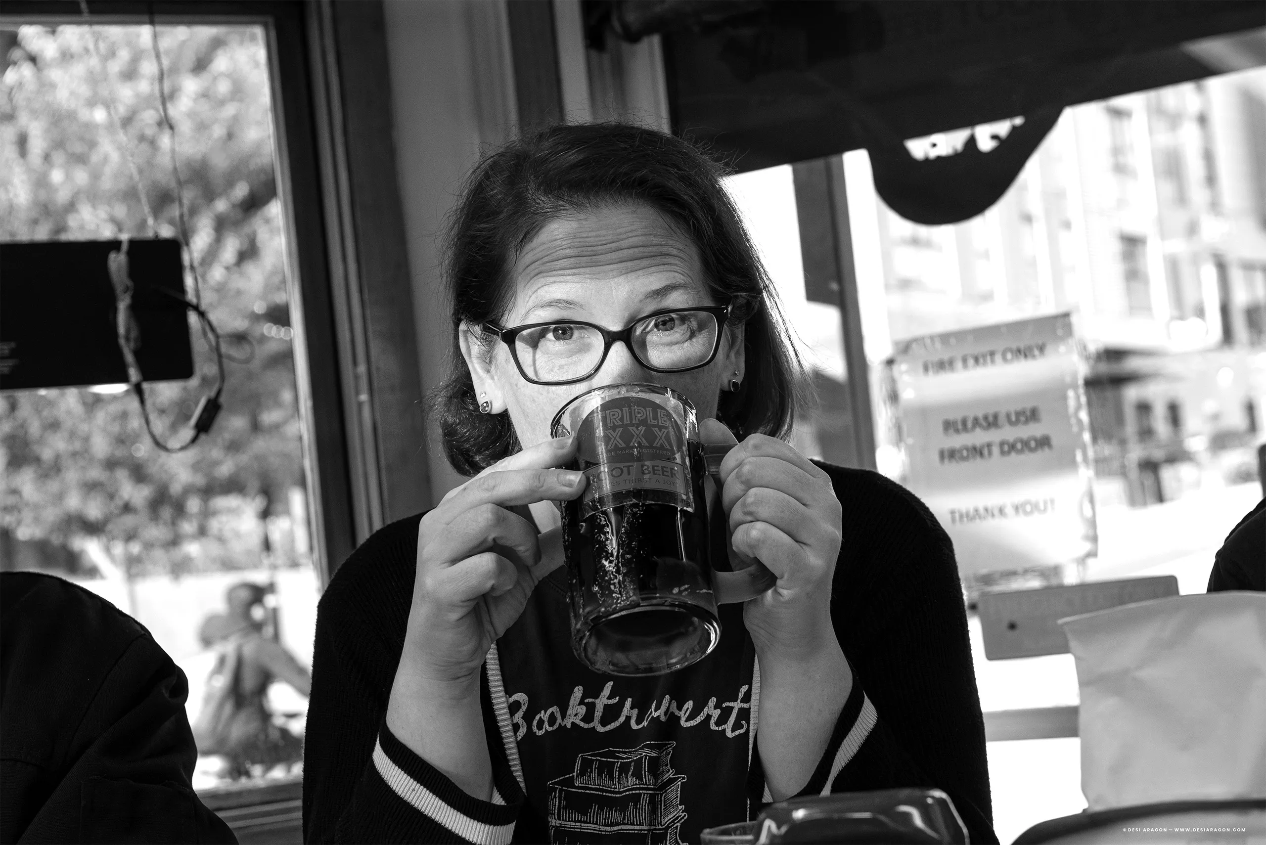
My passion for photography began with documenting family milestones and grew into capturing candid, spirited moments that tell a story. Over time, I developed a natural eye for framing and composition, leading to opportunities beyond personal work. Today, I primarily shoot with Nikon to achieve my signature style, focusing on memorable shots that blend narrative and emotion.


This project required creating custom iconography for dozens of points of interest while balancing decorative and interactive elements. I developed a semi-isometric map design with a diorama feel, allowing the layout to remain compact and visually engaging. The result was a bold centerpiece that highlighted Southern Indiana’s character and guided users through its attractions.


I’m a Filipino-American creative whose spark runs deep in my family, and while my cousins pursued other professional practices, I found my path in art, storytelling, and design. Early on, I became fascinated with science fiction and fantasy. The worlds, characters, and story arcs have always inspired my curiosity and imagination. Beyond design, I stay active and curious, practicing martial arts at Aikijutsu of Arizona and exploring personal product concepts, imagining how they might work in reality. I also enjoy cooking spontaneous dishes for my wife and two fast-growing kids while getting creative with our leftovers.
Through design, I create meaningful experiences that spark connection and collaboration. Professionally, during my 6+ year tenure at Simpleview, I applied this approach to shape digital products that blended story, motion, and usability, engaging audiences worldwide. My work makes destinations more engaging and inviting, inspiring people who may have only heard about a place to want to experience it for themselves.
Here’s a selection of featured projects that bring these ideas to life. These projects represent the work I’m most proud of, where story, design, and interaction come together in a continuous creative flow.


.webp)
.webp)